Tuesday 29 April 2014

2.2 Goldwork Samples (1)

I started by creating some samples using traditional gold work threads on a silk background.  Each red silk square is 10 x10 cm.

2.2.1
Top left:             Outline in Millary with inner grid in Passing
Top right:           Smooth Purl
Centre:               Weave pattern of Rough Purl and Bright Check
Bottom left:       3-ply Twist
Bottom right:    Pearl Pearl

I moved onto using small pieces of traditional threads to create texture.  

2.2.2
Top left:              Wire Check

Top right:            Smooth Purl
Centre:                Rough Purl with some pieces arched to create added texture
Bottom left:         Gold beads
Bottom right:       Mix of Wire Check, Smooth Purl and Rough Purl


I then tried a couple of samples using non-traditional materials.  The first is gilt metal sheet which has been cut and then either inscribed with different patterns or formed over round and square dowelling rods.

2.2.3
I then wrapped different weights of gilt wire over a tapered pencil end to create a cone shape, over the rectangular end of a wooden skewer (the wire created a nice twisted effect as I pulled it off the skewer) or wrapped round a wooden dowelling rods of various thickness to create small 'springs'.  This created a highly textured piece (which gets a bit lost in the photograph).

2.2.4
This is probably my favourite sample so far as I liked the way the shapes could be added either upright or on the side to create a variety of textures from three basic shapes.  

My next post will look at traditional materials used in unconventional ways and further non-traditional materials. 

Sunday 4 August 2013

2.1 Opus Angelicanum Study

It has been some time since I last posted as I struggled with a problem in my left eye - first a detachment of the gel in the eye followed by a couple of tears in the retina.  It has all been sorted out and my blurred vision has gradually returned to normal,  albeit a couple of blind spots which I am told my brain will gradually start to ignore and fill in the blanks (quite apt really as that is what our brain does to fill in the gaps in drawings). 

I visited the V&A to look at the Opus Angelicanum on view in the Medieval and Renaissance Gallery and spent a pleasant few hours drawing and taking pictures.  I love this work - the detail, the fine stitching, the naive figures and the colours; although completed in the medieval period it has a modern feel.

Once home I also did some research on-line and worked up some line drawings.  


2.1.1

I painted the images using acrylic inks and gold pearlescent paint as they have a transparency which suits the subject matter.  I mounted all the drawings on A3 black paper, added a page of calligraphy using a quote from Matthew Pope a 13th century chronicler and some other drawings in the style of an illuminated manuscript.  Here is the result:

2.1.2

2.1.3

2.1.4

2.1.5

2.1.6

2.1.7

Sunday 27 January 2013

1.12 Towards an Embroidered Item (1)

I decided to continue my theme of looking through layers and to build up the background.  I took some hand-dyed blue tissue paper (approximately A3 size) and applied some Bondaweb which I had painted in three different colours (Autumn Gold, Sundown Magenta and Moon Violet) using Pearlescent Liquid Acrylic.  

 1.12.1
I then layered some translucent fabric pieces across the right-hand side of the fabric (lace, organza, etc) and laid some long strands of cotton floss across the left-hand side, secured under a chiffon scarf.  I bonded all the layers together using a hot iron.  


1.12.2
I then machined stitched some wavy lines across the fabric fairly randomly to provide another layer.  Although not clear in the photograph I using different coloured threads bobbin threads to create a different effect in certain areas of the fabric.  


1.12.3
1.12.4 (Detail)
1.12.5 (Detail)

To show more effectively the layers, the next image is the fabric held up against a window. 

1.12.6
I decided to use one of the abstract shapes I had produced in Chapter 9.  I actually combined two of the shapes together and when moving them about I created a third 'S' shape in the negative space which was quite interesting.   I traced both the positive and negative shape onto tissue paper and machined round the edges so that I could cut out the shapes.  Unfortunately, my sewing machine decided to breakdown after machining three or four shapes, however, rather than stop and interrupt my flow as the fabric was bonded together, I could continue to cut out the shapes without the edges coming apart.  I then began to re-arrange the shapes in various combinations to see the effects.  

1.12.7
1.12.8
1.12.9
I particularly like the next three images which somehow remind me of the pier support structure at the coast.   
1.12.10
1.12.11
1.12.12
The next two images are the original positive and then the negative shape placed randomly as an image to look at a further abstract effect.  Although I say random, there is of course, some conscious or sub-conscious placing of the shapes in order to achieve some form of harmony in either colour or shape or both.  

1.12.13
1.12.14
This is the last exercise before I start working towards my proposal for an embroidered three dimensional piece.  I have found the exercises very useful as they have opened my eyes in finding new shapes, ideas or colour combinations from unexpected sources.  Before I started all the exercises I had a certain end-piece in mind whilst now that has changed to a considerable degree.  

Sunday 6 January 2013

1.10 Design Process: Bold

I produced two bold designs of my wave pattern - the first uses an automatic No. 6 pen and acrylic ink on a sponged background (A4);  the second the edge of a 3 inch square sponge and acrylic ink (A3).  

1.1o.1
 1.10.2

I decided to develop the second image as I had already completed some design work on a similar image to the first in an earlier chapter.  

I copied the central section of the second image using my ink jet printer (A4 size).  Unfortunately, my colour cartridge was running out so the resultant image had no blue in it.  This is another one of those happy accidents as I quite liked the colour scheme of reds, yellows, pinks and oranges.

1.10.3

In the first image I cut the copied image into rectangles and rearranged them; overall I don't think this was successful although cutting the larger image into smaller rectangles highlighted some bold shapes within the individual rectangles which I liked, such as  bottom row 2nd from the left.   

1.10.4

I then cut an image into long narrow strips and off-set the individual strips, framing the central section.  Here I liked some of the combination of strips (3-5 and 7-9), both in terms of colour and shapes.  It has the feeling of a galaxy and supernovas to me.  

1.10.5

My third image is the A4 copy cut into diamond shapes, with the two vertical edges left intact to hold the shapes together.  I liked the repeat colours in this image.  

1.10.6

My final image is made up of 30 degree triangular segments re-arrange in an abstract manner, with some segments overlapping.  Again, the framed central portion is shown.  I liked the repeated red triangles in this image which I feel revolve around the central yellow area.  

This chapter has made me realise how cutting up an image can highlight specific new shapes and images within a defined section, which perhaps you may not have noticed in the larger overall image.  It has also emphasised how rearranging an image can create exciting new shapes or colour combinations.  


Tuesday 1 January 2013

1.9 Design Process: Abstracted Fragments

I chose this option as my drawings are quite detailed, precise and realistic and therefore I felt this option may help me to loosen up.  I looked through my images from the coast and decided to continue on my theme of layers and looking through;  I came across an image of a theatre at Eastbourne and noticed in a small section of the photograph in the door glass that you could see abstracted reflections, one of which looked like a curved wave.  I  choose this shape to develop.  


1.9.1

1.9.2


1.9.3

These images (all 4x7 cm) are:

  1. Original shape extended beyond the rectangle.
  2. Extended beyond the rectangle with lines added.
  3. Within the rectangle.
  4. Lines rotated 180 degrees within rectangle and mirror image. 
  5. Image 3, with lines rotates 90 degrees and inserted twice.  
  6. Lines rotates horizontally and vertically, with 180 degree rotation.
  7. Lines rotated 180 degrees and extended beyond a faint rectangle.
  8. Original lines with no box.
  9. Lines and rotated 180 degree lines, no box.
  10. Lines, rotated 180 and 45 degrees with no box.
  11. Circles added.
  12. Circles and shading within rectangle.
  13. Circles, shading and patterns within rectangle.  
One of the surprising things to emerge from this exercise was the difference a rectangle (the traditional picture shape) can make to an image.  In one way it helped to define the overall shapes but in another it restricted the freedom of the lines and almost seemed to stop the 'movement' within the image.  

I then explored the image in a computer programme; I used Photoshop as I do not have a drawing or painting programme on my computer.  


1.9.4
  Clockwise from the top left are:

  1. Original scanned image.
  2. Liquify.
  3. Plastic Wrap.
  4. Polar.
  5. Zig-zag.
  6. Wave.
  7. Pointillise.
  8. Ocean Ripple.
The images produced by Liquify and Zig-zag are probably my favourite results.

I then went on to add colour, acrylic inks, to the image (8x14 cm).  

1.9.5 
  1.9.6

Clockwise from the top left:

  1. Equal amount of complementary opposites.
  2. Mainly harmonious colours with one area the complementary.
  3. Mostly lightly toned with one darker toned area.
  4. Similar colours across connected shapes.
  5. Complementaries, one higher proportion.
  6. Reverse of 5 above.
The use of the complementaries really made the opposite colour intense, this is particularly evident in the purple and yellow images; this is also true in the green and red.  The small darker tone in image 3 also looks darker when completely surrounded by lighter tones.

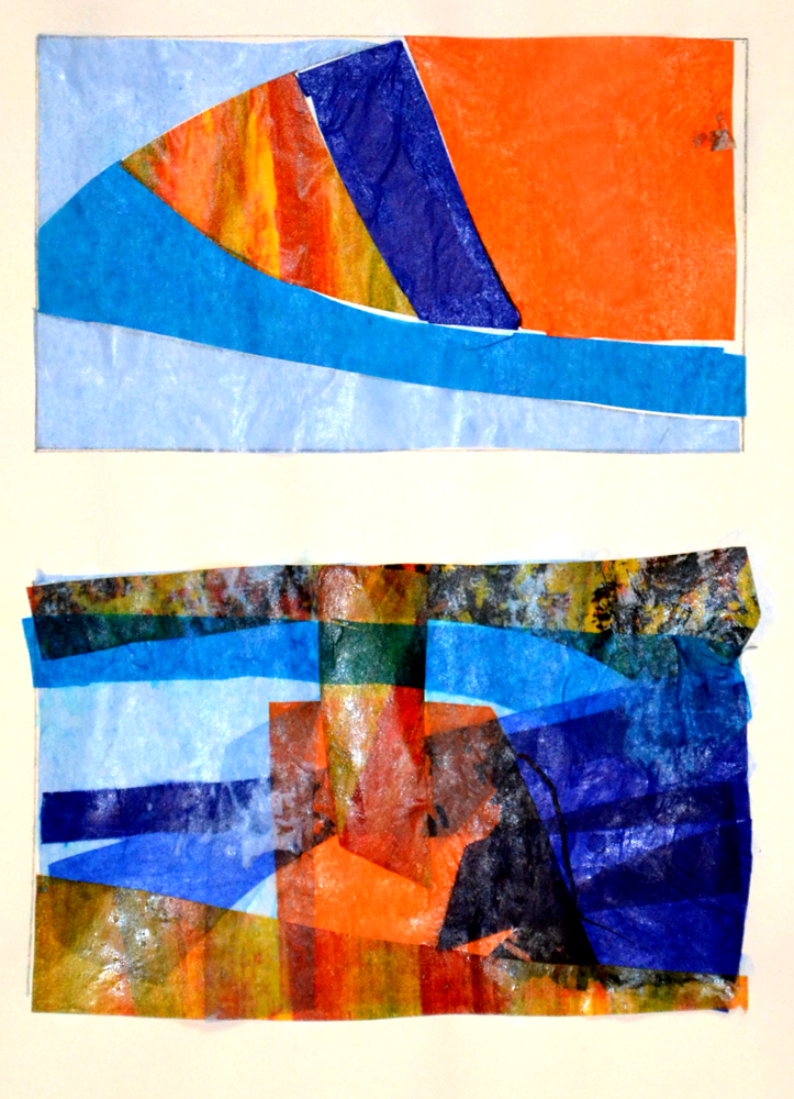
I continued the exercise and my theme of looking through and layers by using plain and patterned tissue paper.  

 1.9.7
 1.9.8
 1.9.9
1.9.10

The top image is the original lines with tissue shapes inserted.  I then used this to cut out multiple shapes of different tissue papers and reinserted them into the rectangle to form new abstract images; the last image is without the rectangle.  I particularly like the lower image on 1.9.7 and image 1.9.9.

As I liked the effect of these shapes. I produced a layered image of waves using one of the abstracted shapes and a new wave shape from one of my preliminarily sketches.  

1.9.11
From the top of the image the layers are a graduated acrylic ink wash; crumpled dyed muslin to give the impression of the foam produced at the top of waves; layers of the abstracted shape in both plain and coloured tissue papers; and, layers of the new abstracted shapes in blues and pinks.  The photograph does not bring out the lighter coloured tissue papers very well but overall I am quite pleased with the final image.  The main change change I would make is to reverse the pink colours at the base of the image, as the darker toned pink at the bottom is quite dominant, it draws the eye and stops the movement within the picture.  

My final set of images within this section are layering different papers, stitched lines and reverse applique, within the original abstracted shapes.  

 1.9.12
 1.9.13
     1.9.14
The top image is layered Amaretto biscuit papers in different colours, remains from over-indulgence at Christmas, but I really liked these papers and the colours and wanted to see what effect they would create if layered and cut away.  The middle image is a selection of papers in complementary colours.  The lower image is layers of patterned origami papers; I really like the contrast between the small and large patterns created in this image.  

This chapter has surprised me on the range of images that can be created from a fairly simple intersection of lines in a small cross-section of one photograph.  It makes you wonder how much diverse work could be produced from one single original image!  

Saturday 15 December 2012

Review of Project

I started to lose some inspiration from my subject, was not happy with the quality of my work and ask Sian for some feedback on my progress so that I could determine my way forwards.  Sian questioned whether I had been thinking about the direction of my theme and suggested I review all my work and posts to look at my strengths, where my passions lie and enjoy those aspects of my results that have worked. 

One comment that really made me think is my need to present solutions rather than treat the exercises as an investigative journey.  Sian also used one or two quotes from my blog to help me decide on my future progress and I extended this by reviewing all my posts and picking out those aspects of my work that I have really enjoyed. 
  • looking through the broken shell
  • rock pools with mini waves; looking through the layers
  • reflective, translucent light, water reflecting the light
  • waves, gradually fading
  • overlapping translucent layers, producing different tones and new shapes within shapes
  • sun-ray effect of folded dyed fabric; the effect where the resist has left interesting patterns and ghost-like effects of the object
  • gradually faded blue pattern; transferred image fades the more times it is used.
I then thought about these words and how I would progress for about a week and rather than repeating the exercises, I decided to explore those themes I have enjoyed in my work in the next chapters of Design Process and Towards an Embroidered Item, adding addition exercises where needed.     

Monday 3 December 2012

1.7 Stitches

I used some of my transfer dyed backgrounds for these exercises.  In the first image I have used open buttonhole stitch on the left half , in various weights of threads, with varying distance between each stitch, overlapping rows and graduating the length of the stitch.  On the right half I have put a base layer of machine stitch, alternative rows and overlaid with chain stitch, and a central area of couching. 

#1.7.1 

In the next sample I thought  I would try using a dark background to see the effect on the colours of the threads.  Stitches used include open buttonhole, cross, wheatear, basket filling, running, etc.

#1.7.2 
My third sample includes three areas.  The left third is circles of back stitch, with some filling in with shiny satin stitches and the circles linked by thin threads.  The central section is straight stitches of various long lengths in various shades of blue, giving a wave effect.  The right section has small frayed sections of dyed muslin overlaid with upright cross stitch in various weights of thread. 

#1.7.3

My final stitch sample was an experiment with dyed tissue paper on clear cellophane with two weights of thread using running stitch.  As I worked this sample the number of stitches had to be limited to stop the cellophane splitting. 

 #1.7.4